A Micro Look at Printing Alpha, by John Molseed
Every now and then I am bequeathed a rare blessing as the innkeeper of this blag. April was such a month, when I was contacted by a man named John on the prospect of him writing a blog post regarding some minutiae of Alpha printing patterns. I welcomed his idea, and was then pleasantly surprised by both the quality his writing and his deep knowledge on the subject. I, however, kinda suck at updating this blag these days, so this post is like a month overdue for everyone else who find gleeful passion in going deep nerd on the very first print run. So enough stalling. It is my great pleasure to finally give the soap box to John Molseed. /Mg out
This blog has occasionally noted some of the variations in the Alpha run of the first edition of Magic. It has explored the existence of an Alpha edition Volcanic Island (it doesn’t exist), pondered print runs and rehashed rewordings. A couple posts make passing note of the color variation between some Alpha and Beta cards. Let’s tie these all together in a deep dive into the initial run of Magic’s first printing.
In 1993, collectible card games didn’t exist. Two entities – Wizards of the Coast and Cartamundi – were each doing their own thing. Wizards would design a game and hire a printing or production company to make it. Cartamundi would take orders for playing cards or collectible cards, put together the print plates and run 132-card sheets through their presses. Neither expected Magic: The Gathering to be the success it was and to become a prototype for a new collectible. For Wizards, it was just another game. For Cartamundi, it was just another print order.
This information comes from an informal interview I did with a European pressman who worked for Cartamundi. We were playing cards over pints, so take it with a grain of salt, but it’s still some fun, behind-the-scenes printing nerd stuff.
As Alpha rolled off the presses, the cards were separated – cut with sharp, 90-degree corners like the Collectors Editions have. They were then sent through a die to round the corners. The die is basically a big, sharp, metal tube to give the cards rounded corners.
The rounder, 2 mm die used to shape the cards was probably a spot decision by whatever pressmen were working at the time Alpha was being printed. It was never noted or logged anywhere because Cartamundi didn’t note such minutiae. This was just another playing card order to print and package.
That die used might have been dropped a few times because the corners aren’t entirely symmetrical. Alpha collectors know the corners of their cards don’t always line up. However, if you rotate or flip the cards, you can come up with a symmetrical stack. That’s because the cards were sent through the unsymmetrical die in varying directions. Another detail that didn’t matter at the time.
After the approximately 2.5 million-card Alpha print run sold out, game designers also noted some errors in the first run and wanted to add some new cards. (The original art for Volcanic Island was shifted to become Birds of Paradise. Art for Circle of Protection: Black was late and didn’t get to final design and plating in time for the Alpha run.) So another run of cards was ordered and Cartamundi did their thing. Except not everyone at Cartamundi or Wizards of the Coast did their thing quite right.
Designers at Wizards didn’t properly tone the changed cards. In toning, you basically bring closer together your darkest and brightest spots on the cyan, magenta, yellow and black channels and then lighten the image overall for better readability. The Alpha run was toned terribly. Almost all of the new or corrected cards weren’t toned at all. As a result, Icy Manipulator, with its new rules text, Sedge Troll, Red Elemental Blast and Channel among others all have darker colors. Nearly every card that was corrected and re-plated has darker tones for that reason. They also had the full black border unlike their Alpha counterparts. (The partial, inner black border and the later-added outer black frame on Alpha cards was likely another last-minute production quick-fix.)
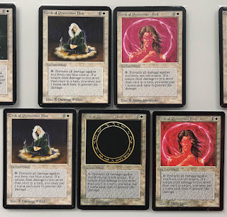
The new cards did too, including the much darker basic lands. For example, an Alpha CoP: Red has the same color and tone as the other Alpha CoPs. But the corrected Beta CoP: Red (with Mark Tedin credited as the illustrator) has the same tone as the newly-plated CoP: Black while a Beta CoP: Blue has the same tone as its Alpha counterparts.
 |
New cover art for Rolling Stones' "Gimme Shelter" single. |
This wasn’t intentional. The Beta run was intended to be indistinguishable from the Alpha run. In fact, some rare cards leftover from the Alpha run were set aside to package with the newly printed cards. (Hence the Alpha rares in Beta packages.)
So Beta was printed with new (and darker) plates for corrected cards. Then came time to cut the cards.
This time, a less rounded 1-mm die was chosen to cut them. A few people noticed. Although several legends and excuses have been repeated about this change, the fact that some Alpha-cut cards have since slipped out into circulation in later printings (such as Fourth Edition) reinforces the point that it had nothing to do with a dull or dirty die. It was simply print staff oversight.
Now for the fun part.
The newly-plated cards are fairly easy to spot with the differences in tone and wording (though corrected black cards aren’t immediately obvious). But what about other cards that didn’t get new print plates? How can you tell an Alpha Time Walk from a clipped Beta Time Walk?
With the widening difference in price between Alpha and Beta editions, it matters to collectors. It especially matters to players who exclusively play with Alpha cards. Some members of the Alpha 40 Worldwide group have literally taken a fine lens to this problem.
Offsets are helping, well, offset, the threat of clipped Beta cards and re-backed Collectors Edition Cards from being passed off as Alpha cards. In production, printing plates didn’t line up absolutely perfectly from print run to print run.
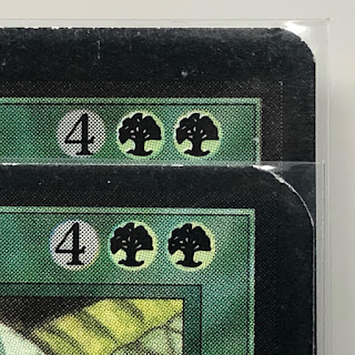
Each early Magic print run has an offset fingerprint. From a distance, you don’t see it. However, with a magnifier and a bit of eye training, you can pick up a cyan offset of a fraction of a millimeter. Some are more obvious than others (such as the position of the mana symbol on these Craw Wurms).
 |
The black plate of text was slightly misaligned down and to the right on the Beta Craw Wurm. |
The Alpha 40 Worldwide group is amassing a small database to help their players to better spot the differences.
 |
Is there something shady about the Icy Manipulator on the right? |
Here in the U.S., they say baseball is a game of inches. Playing Alpha, is a game of micrometers.
 |
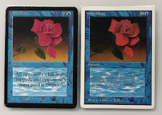
| A rose by any other name still taps out all your lands, sucka! |

Pertaining to the subject, a post from the magic librarities forum where the now infamous Alpha Volcanic Island was discussed. The author of the response had more info on the Alpha printing after he discussed with Dave Howell, production manager at Wizards of the Coast back then
SvaraRaderahttps://www.magiclibrarities.net/forum/viewtopic.php?f=4&t=5557&hilit=alpha+volcanic+island#p88595
Hi MG and all you old school folks. Tank you for an interesting contest. Havel a nice summer!
SvaraRaderaMCW Exchange is truly impressive! Their platform offers seamless transactions, strong security, and excellent customer support. Highly recommended for anyone looking to trade efficiently and reliably in today’s market.
SvaraRaderamcw exchange