Typesetting Troubles in Alpha
Card templating demand precision and accuracy. If we look back at the history of Magic typesetting, we'll quickly find examples of cards with the wrong text (like Time Elemental in Spanish 4th Edition), cards with text omitted (like Vampire Bats in Chinese 4th Edition), or cards with their text offset incorrectly.
 |
| The right Gaea's Touch has incorrect offset on text and symbols; a fairly common error on this particular card. |
Another possible typesetting error is accidental printing with the wrong font. The most famous font error in Magic is probably Æṛathi Berserker from Legends. While it didn't exactly get printed with the wrong font, the letter 'Æ' didn't exist in the standard Magic font at the time so it was printed with the first letter of its name omitted.
 |
| Reasonably fun fact is that 'Æ' exists in the italicized flavor text font. Additional reasonably fun fact is that WotC created a plane called 'Rath' a couple of years later inspired by this error. |
Notes are typically given to the typesetter on how the card should be set up. But occasionally these notes are missed and the notes themselves end up on the card rather than the symbols they represented. For Magic, this was a particular problem in the Alpha run of Limited Edition. And I can kinda see how it could happen. Before Alpha there was no Magic and the typesetters would have no idea of the rules of the game. The text box would read as gibberish to most, so one might think that "GGGG" is some sort of rules concept rather than a typographical note.
 |
| The reason Force of Nature in Alpha is seventy times cooler than in Beta. |
 |
| Unlimited Edition with correct symbols to the left, Alpha with typographical error to the right. |
We should note that typesetting errors are not the same as basic misspellings or errors in capitalization. Sloppy editing was not that uncommon back in the days, but these things had little to do with the typesetting.
 |
| Black Vise in Alpha, Beta, and Unlimited. All have identical ("correct") typesetting, but a formatting error on capitalization in the rules text. |
 |
| Phantasmal Forces in Alpha, Beta, and Unlimited. Here the typesetter failed to replace the 'U' in the text box with a blue mana symbol. This was immediately corrected in the following printings. |
Incorrect symbols in the text box was a thing for all creatures requiring upkeep mana in Alpha. Here's the last one of those three cards:
 |
| Rad. |
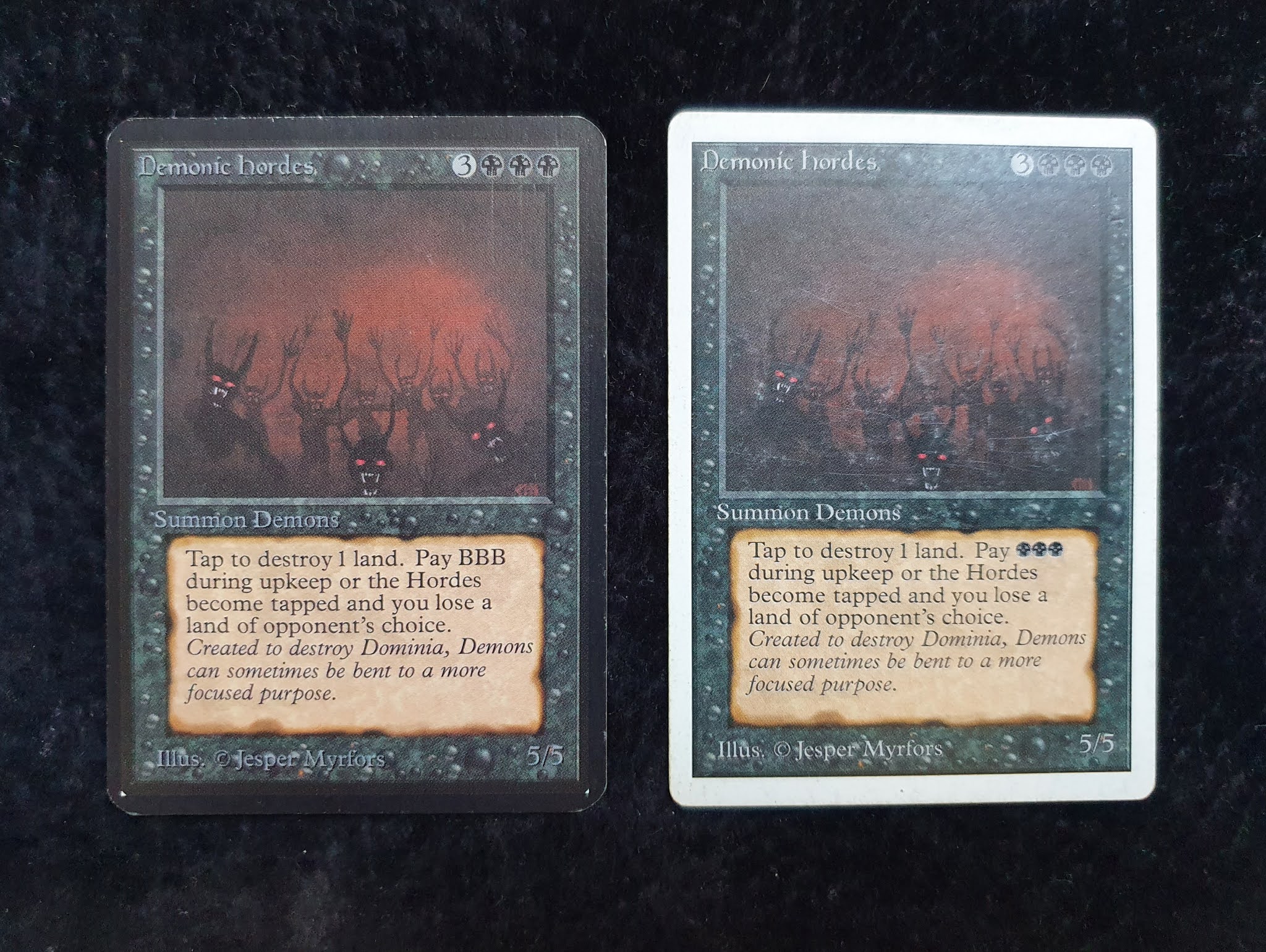
On many non-land cards colored mana was simply typed out. "Add 3
black mana", "Add 1 white mana", and so on. Text boxes on cards like Mox Ruby, Dark Ritual,
and Llanowar Elves might just have added to the confusion for a printing
professional looking at the "BBB" note on Demonic Hordes.

Now one might assume that they missed the notes for all mana symbol in creature text boxes, but they actually got most of them right. All activated abilities were written correctly, and on cards like Dragon Whelp they also got it right in the rules text following the ability.
 |
| Yeah, I know the right one is a Beta and not an Alpha. Text box is identical on the two printings though, and I ain't spending no extra effort on an Alpha Whelp unless I get some sweet typographical error action. And while I guess missing a line break and starting the flavor text at the same line as the rules text is kinda blameworthy, that strangeness stayed with the card all the way until 4th Edition. |
There is however one more creature that failed the typesetting of mana symbols pretty spectacularly. And this is possibly the most Alpha textbox of any creature in the set. I don't own this card in Alpha myself, so please enjoy these stock images.
 |
| Alpha to the left, Beta to the right. Let's all agree that this text box is pure metal regardless of typesetting shenanigans. "New heads may be grown for RRR apiece". Wizard. |
The last card where they messed up the mana symbols in the text box was Drain Life. Alpha Drain Life is hence about seventeen times more oldschool than Beta Drain Life.
 |
| The Beta version has identical typesetting to Unlimited (all Beta cards do). |
If we decide to go rather deep here, we find that most any card that mention colored mana in other contexts than activation costs or adding mana to the mana pool failed to set the symbols correctly. Which leads me to - for the first time in my 27-year Magic history - raising my glass in respect to the rules text on Farmstead.
 |
| How on Earth did they get this one right? |
Full disclosure, they also got the notes correct on Stasis and Conversion, but I still think Farmstead is due for some credit here.
Apart from mana symbols, there were a couple other typesetting issues in that first batch of cardboard crack. One of them I'm not really sure how it occurred, as the best explanation I've found is that it was "a typographical error ... caused by a global replacement error". What kind of global replacement error leads to this outcome I don't know, but the end result is rad.
 |
| "[E]nchantments on creature are CARD ed." Take that, English language. |
Our last card today might well be my favorite of the bunch. At least if we go purely on typesetting errors and not how likely I am to sleeve it up. It looks so strange, yet so very readable. This is another card I don't own in Alpha, so here goes stock images:
 |
| Fun thing is, "//" is a common way in typography to represent a line break. I can see how one might not catch that "GGGG" should be replaced by four green circles with trees, but "//" isn't that cryptic. |
Not many people can claim to have a playset of Alpha Birds of Paradise, but a good number of the people I know who do view that playset as the crown of their collection, eking
out both Juzams and Power on their personal scale of iconic. I've seen people take such a radical pride and joy in their Alpha Birds that it is hard to find comparisons with other cards. The typesetting error help tell a story of a card rushed, a mostly un-tested card made to find use for art that was rejected for a dual land, and that somehow became one of the most recognized and defining creatures in Magic.
Hi MG, it occours to me, I have not seen many alpha cards. Definitely very OS topic. If one could travel in time and be there, when alpha was created. Seems like very adventurous job. As always all the best to you and GGGG!
SvaraRaderaThanks Jirka :) GGGGs to you as well!
RaderaThese are awesome cards. Even with the typo, it makes them unique. I asked about it from a Magic the Gathering near me Store, https://largerthanlifetoys.com/ and they told me that these are extremely rare cards now!
SvaraRaderaThanks Don. Yeah, not that many of these card are out there anymore, in particular the rare ones like Birds of Paradise and Demonic Hordes. I feel very happy and privileged that I get the chance to sleeve them up and play with them :)
RaderaInteresting about these early printings is that they felt really old to me even back in 95-96 when I first saw them. I mean 10 year old cards from say Innistrad don´t nearly feel as old today as the alpha/beta cards did to me back in 96. And I feel that 5th edition cards look new even today, although is ~25 years old by now.
SvaraRaderaYeah, I very much agree. Strange thing that.
Radera